EduPage web pages for mobile phones
The number of users viewing EduPage web pages in smartphones is rising.
The new designs display correctly on a large screen as well as on a smaller smartphone screens.
Some of the former EduPage designs did not respect this. We recommend change to a new design: How to change the web page design
What is the difference?
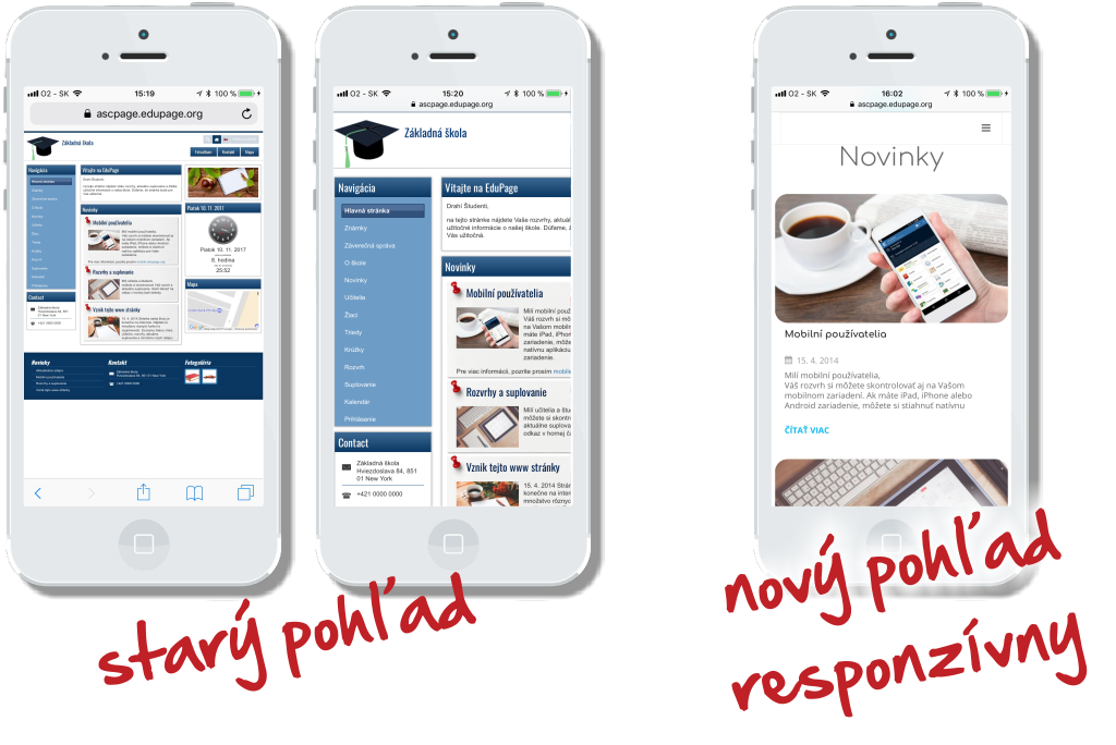
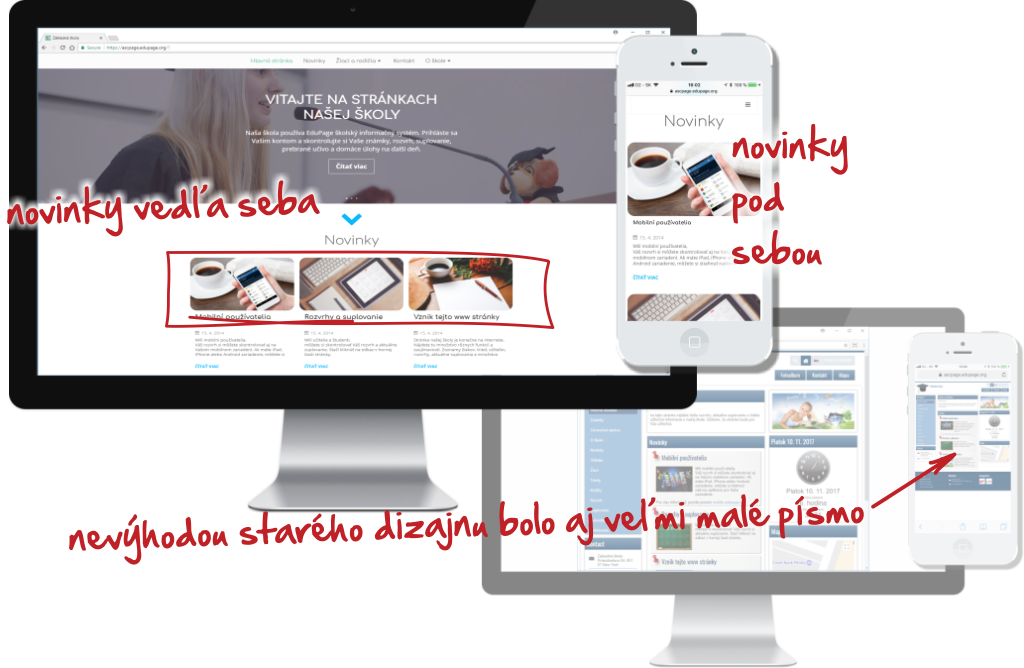
Former designs display the whole page in minute prints or the user zoom in the page and can only see part of the page. See pictures on the left.
Responsive design adjusts the content of the page to the screen size. The smartphone or tablet grants the parent, student and teacher comfortable display and viewing of the web page content. E.g. if the text going with the image does not fit next to the image, it can be moved below the image. When displaying information on a computer monitor, the text will be displayed next tot the image.
No more manual zooming in on the content. As you can see, there is a striking difference between the former and the current design.

 Slovenčina
  Deutsch
  España
  Francais
  Polish
  Russian
  Čeština
  Greek
Greek  Lithuania
  Romanian
  Arabic
  Português
  Indonesian
  Croatian
  Serbia
  Farsi
Farsi  Hebrew
  Mongolian
  Bulgarian
  Georgia
  Azerbaijani
  Thai
Thai  Turkish
  Magyar
